The Xperia Ion is the biggest handset in Sony’s line-up. It’s also
the first one to have LTE support. Check out our full review of the Sony Xperia Ion after the break.
In a lot of ways, the Xperia Ion might look like the bigger sibling of the Xperia S but with a lot of similarities. We recommend you reading up on our review of the Sony Xperia S so you’ll know what we’re talking about.
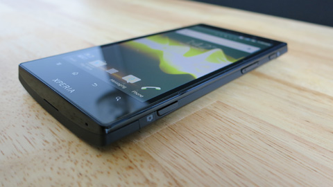
The review unit that we have here is the L28i model which is LTE
capable but since we still don’t ave any commercial LTE available in the
Philippines, we can’t really test that one out. I recently talked to
the PM of Sony Mobile and discussed the possibility of them releasing
this model in the Philippines but we could not really get concerete
details.
Design and Construction.
The Xperia Ion is big and bold, even heavyset for its size. Those
metal plates at the back might have contributed to that. The handset has
a metal and polycarbonate unibody design with flat front panel, wedged
corners and curved back just like the other NXT line.
The are a lot of visible buttons and ports in here — a large 3.5mm
audio jack is smack in the center of the topside, the power button is on
the right side along with the volume rocker and the dedicated camera
button.
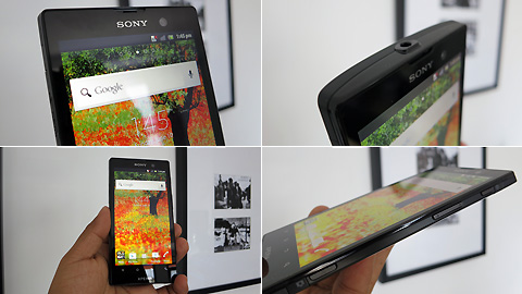
On the left side, the micro-USB port and the micro-HDMI ports are
hidden by a flip cover. At the back is the 12-megapixel camera with the
LED flash just below it along with the speaker grills.
The top end has is a plastic cap which can be removed by sliding to
expose the slots for the micro-SIM card and the micro-SD card.
Up at front is a large sheet of glass that covers the entire front
panel. There are four soft buttons at the botom end — Back, Home, Menu
and Search — and a large Xperia logo just below it.

Sony still uses that NXT design signature that’s monolithic and a bit
bulky. In fact, it’s the only flagship handset we’ve seen that’s not
under 10mm thin (this one is 10.8mm). Nevertheless, the industrial look,
brushed-metal finish and solid build is what differentiates it from the
rest of the pack.
Display.
The large 4.6-inch display comes with a 720p HD Reality Display that
we’ve been seeing since the Xperia Arc days, right up to the new Xperia
line-up.
The screen is a bright and crisp as the one on the Xperia S, with
rich vivid colors and just the right amount of color saturation. With a
720×1280-pixel resolution, you get a really packed screen with a pixel
density of 323ppi.
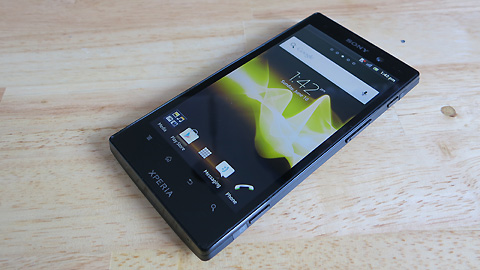
Outdoor visibility is greatly affected, especially under direct
sunlight but that’s pretty much expected. You can still use it if you
have the brightness cranked up to the highest setting.
The Mobile Bravia Engine helps a bit when viewing photos and videos
stored in the Gallery but I don’t notice its effect when using the
browser or playing games.
OS and UI.
The handset comes pre-installed with Android 2.3.7 Gingerbread. It
would have been nice if they already used ICS on this one but at the
rate we’re seeing, the Xperia Ion might take a few more months to get
the update (the Xperia S which was released in February has started
getting ICS this month so that’s a 4-month delay).
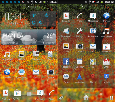
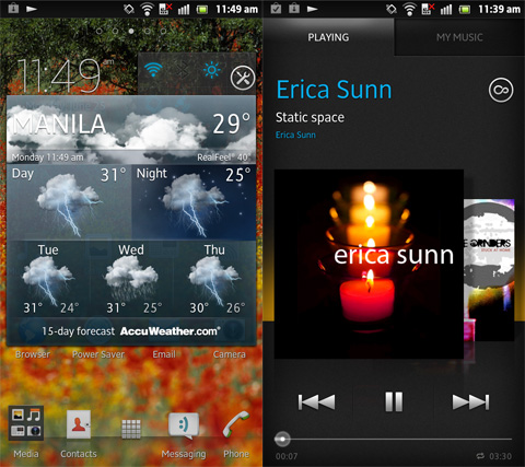
Sony’s Timescape UI is among the nicest UI skinned on top of an
Android OS. There aren’t a lot of native widgets but the ones that are
available are pretty neatly done.
We loved the PlayOn feature that’s integrated into the menu so you
can thrown multimedia content (music, video, photos) to another Sony
device (like a Vaio or a Bravia TV) wirelessly.
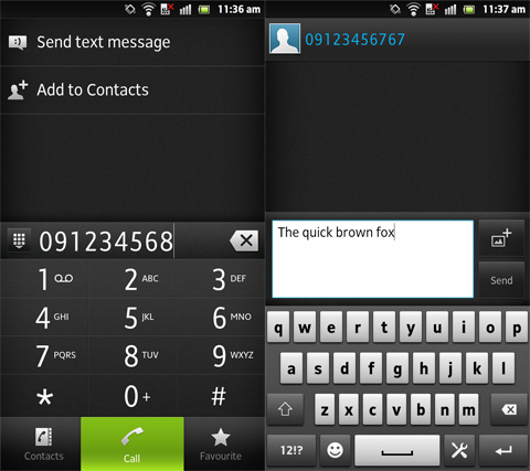
The native Xperia virtual keyboard is simple and easy to use. The keys are large enough and well-spaced from each other.
Multimedia and Camera.
After using the camera on the Xperia S and the mid-range Xperia P, we
had high expectations with the 12-megapixel shooter of the Xperia Ion.
Unfortunately, we were a bit disappointed. While photo quality looked
good, it’s not any better than the Xperia S or Xperia P. In fact, based
on the samples we’ve taken, the Xperia P photos we took turned out
better than the Xperia Ion.


