We posted our review of the Sony Xperia S a couple of months ago and now its smaller siblings are here to complete the line-up. Check out our full review of the Sony Xperia P after the break.

When Sony announced the NXT line (Xperia S, P & U) as their first
batch of handsets post-Sony-Ericsson era, the proposition was simple —
create a singular design pattern and break each one down by size and
configuration.
That’s the reason why the Xperia P looks almost identical to its big brother (the Xperia S) and its little brother (the Xperia U) with some minor re-arrangement of the exterior parts. They even got the uniform design down to the box and packaging.
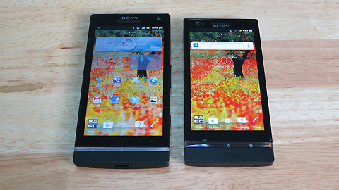
The rationale behind this design approach on all three Xperia
handsets isn’t obvious but I would hazard a guess — that (1) Sony did
not have enough time to make a new design after the divorce from
Ericsson so they could only come up with a single prototype; or (2) Sony
wanted to make a design statement and by making one unique yet
identical design on all three handsets will easily help send the message
across.

To get a better perspective of this review on the Sony Xperia P, go and read our Xperia S review first. Most of our comments on the design and form factor are exactly the same.
Design & Construction
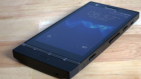
The Xperia P comes with a 4-inch screen, a display size that’s
normally delegated to a majority of mid-range smartphones nowadays. Its
solid, monolithic design reminds us of the Brivia HD TVs that Sony is
very well known for. The smooth matte finish feels good on the hands and
has enough texture to give you a good grip.
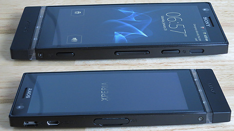
On the right side is where the speaker is found, along with the power button, volume rocker and a dedicated camera button.
The micro-USB and micro-HDMI ports are on the left side with the micro-SIM card slot hidden beneath pop-out cover.
At the back, the 8-megapixel camera is right smack in the middle with the LED flash just a few millimeters above it.

That signature piece of transparent strip of plastic at the bottom is
also illuminated to show an etched icons of the Home, Back and Menu
soft buttons. In the Xperia S, this strip is a bit translucent while the
Xperia P got a bit more transparent piece.
One of the things we immediately noticed with the Xperia P is that
the unibody design is actually made of aluminum and not the
polycarbonate Sony used with the Xperia S. It gives it a bit of heft and
solid feel.
Display
With a 4-inch screen, the Xperia P reminds us of the Xperia X10
from 2 years ago, only way better. Aside from improvements in mobile
processors, one of the most significant advances in mobile technology is
the display. Even if you don’t have Super AMOLED Plus, Retina Display,
or Super IPS+, the regular LCDs already look good on the handset.

The display is bright and crisp, images are vivid and color
saturation is fairly balance. At a resolution of 540×960 pixels, the
Xperia P has a pixel density of 275 which is already pretty good. It’s
not a dense as the 342ppi of the Xperia S but the Xperia P can still
hold on its own (compared the the Xperia S though, the Xperia P didn’t
have that much clarity).
The OS, Apps and the UI
The handset comes with Android 2.3 Gingerbread out of the box. It
would have been nice if Sony used ICS right off the bat (they promised Ice Cream Sandwich will be rolled out soon).
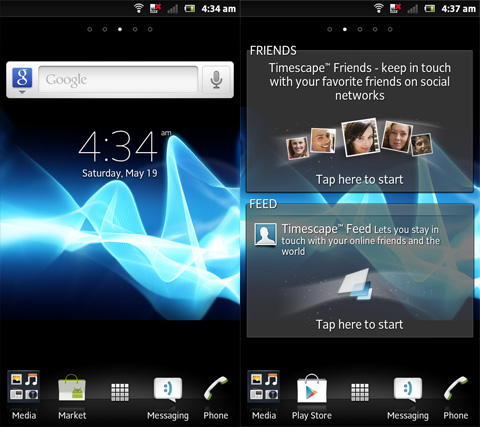
Sony still uses the Timescape UI and we still think that it’s one of
the more good-looking and elegant custom UI out there (right close to
the Sense UI).
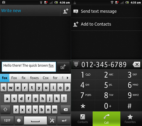
The stock Xperia keyboard is decent; each individual keys are
well-spaced but the letters themselves are narrow so you’d bump into
some occasional mis-types. You can set the default keyboard from the
full-qwerty to the alpha-numeric though if you feel like using it.
If you’re more into swiping, gesture input is also available and
built into the keyboard settings (you just need to activate it).
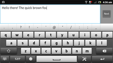
The landscape mode of the full-qwerty keyboard is much better with
very well spaced letters and large keys. Because the size of the Xperia P
isn’t that big, it’s actually very comfortable typing under this
orientation.


